
It dawned on me a few days ago that I’m a venal hypocrite. Last week, I wrote a column about how much I disliked wines with ridiculous names that are used as a branding technique. A few days later, a kindly wine merchant gave me a bottle with a ridiculous but beautiful label, and I realized that although I can’t stand silly names, I am a sucker for style – even if it is only a shameless marketing ploy.
Is there a difference between eccentric names and eccentric labels? Perhaps. Any jerk with a predilection for puns (“Cardinal Zin”) or non-sequitors (“Dirty Laundry Wines”) can bestow a loud name. But the design of a label requires a sense of style at the least and, at the most, an artistic vision. More than that, an elegant label reaffirms something basic about wine itself: that it is a work of art and not just a beverage in a recyclable container. Beautiful bottles are like well-bound books or vintage LPs: the package itself is an artifact worthy of appreciation.
The watershed moment for wine and style was just after World War II, when Baron Phillipe de Rothschild asked the artist Phillipe Julian to design a “victory” themed label for his legendary Bordeaux, Chateau-Mouton Rothschild. Since then, the Rothschilds have commissioned a different artist for every vintage, including Picasso, Andy Warhol and Jean-Paul Riopelle. Their most recent label incorporates a watercolour by Prince Charles. Mouton-Rothschilds bottles are a modernist gallery, seamlessly marrying high art to graphic design. I keep an (empty!) Riopelle as decoration for my cellar.
But beauty does not require celebrity. In Ontario there are some equally gorgeous designs based on homelier themes than triumph over the Nazis. My favourite is the Organized Crime Winery. The winery doesn’t take its name from the Sopranos, but from a historical incident involving two factions of Mennonites and a disagreement over the presence of a pipe organ in church. I don’t believe anyone was capped, but the organ ended up in the river. Scenes from the crime decorate each bottle, rendered in spare, gothic prints of black and white. The LCBO is sold out, but the wine can be purchased from the winery in Beamsville.
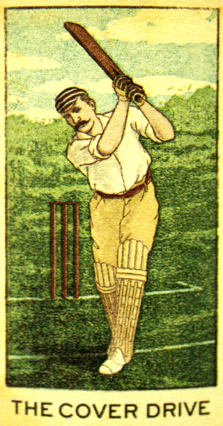
Equally original is the wine that showed up on my door this week, Jim Barry’s The Cover Drive from South Australia ($24.95 [Ed. note: No longer available], Vintages #677476). I was immediately charmed by its label, an antiquated portrait of a cricket batsman driving the ball into the “cover” end of the pitch. The absurd matter-of-factness of the graphic is splendid, and reminds me of one of my favourite cartoonist, Glen Baxter. And the wine? It’s ideal for a BBQ – mellow, silky and redolent with blueberries and ripe plums. It is delectable and at its peak now. Like the label, Cover Drive is straightforward and amusing. Who says you can’t judge a book by its cover?
Matthew Sullivan is a lawyer with the Department of Justice in Toronto. He writes a weekly blog entry here on lawandstyle.ca. The Short Cellar column appears in the print edition of Precedent. Matthew can be reached at matthew@lawandstyle.beta-site.ca

