On October 1, the Law Society of Ontario revealed its new visual brand. The organization had been hard at work on this project: one year ago, it launched a total redesign after it decided to change its name (by replacing “Upper Canada” with “Ontario.”) So the profession has expected this announcement for some time.
But what the Law Society revealed was a surprise. It was speculated — by this magazine, at least — that the new logo would retain some of the imagery in its original coat of arms, which included a range of historical symbols: Hercules, Lady Justice, a beaver and so on.

The Law Society of Ontario’s new logo, revealed on October 1.
Well, historicity has been thrown right out the window with the new logo, which is the kind of modern icon that might represent a fintech startup. It’s composed of three concentric golden circles, united around an empty space. Apparently, this symbolizes the intersection of three bodies: the Law Society, the professions it regulates and the public it serves. It’s both pretty and a complete departure from tradition.
Or perhaps it isn’t. Malcolm Mercer, the current Treasurer of the Law Society, argues that going through the process of revising the logo is, itself, a tradition. “The Law Society has taken a look at its logos from time to time and periodically updated them,” he says. “And this is in the same tradition as that.”

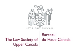
The most recent version of the Law Society’s logo, prior to its 2018 redesign.
Mercer also points out that the new design is easier on the eye than its predecessor. “It’s modern-looking and simple. It’s easier for people to see it, to identify the aspects of it. If you look at the old logo, unless you’re looking at a fairly big version of it, it’s hard to identify what it’s all about.” This is especially true in the era of the smartphone, when most web browsing is done on tiny screens.
The updated branding was launched alongside a new public-awareness campaign, centered around the slogan Our Society Is Your Society, which implies a message that dovetails with the logo: “We’re not some fusty, hidebound organization, but a regulatory body serving your interests.”
Mercer says he’s heard some grumbling about the new design, but that “the predominant comment is positive.” The minority complaints are understandable, he says. “There will always be [disagreement] around matters around aesthetics. There are some who will prefer a different path.”


