The Law Society of Ontario is changing, as evidenced by its very name, which until 2017 was the Law Society of Upper Canada. It was a change not made lightly: the vote took place after two hours of intense argumentation at convocation, during which bencher Rocco Galati characterized the change as “BS window dressing,” while others considered it a helpful move away from a stuffy, elitist image.
And now, another change may be afoot: the Law Society is considering an overhaul of its visual branding. Details, at this point, are pretty vague. An unnamed designer has been hired to sketch a new coat of arms, but there’s no guarantee that it will be adopted and the LSO won’t comment on the process at the moment.
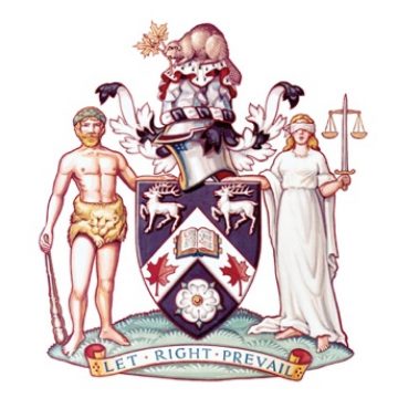
The argument in favour of change is clear. The coat of arms was first painted in 1823 and updated twice — once in 1964 and, most recently, in 1994 — but the images remain dated and potentially alienating. The current imagery still features a shirtless Hercules and a blindfolded Lady Justice flanking a crest covered in a jumble of symbols. But there’s a natural counter-argument, as well: perhaps throwing the arms away, or modifying them substantially, would be a shameful erasure of legal tradition.
There’s something to both of these perspectives. On the one hand, heraldry is a beautiful and vivid visual language, studded with peculiarities. Consider Hercules: his bare-chested presence on the LSO’s coat of arms may seem bizarre, but he is a traditional standard-bearer for the value of strength, which is seen on the arms of both Greece and Andalusia.
On the other hand, I’m a reasonably educated person with some respect for antiquity, but until I read a handy guide on the crest’s symbology, I didn’t understand any of that. What I saw was a half-naked muscle-bound club-wielder, a figure vaguely reminiscent of the Statue of Liberty, a shield with some stuff on it and the maple leaf, an emblem of Canada that’s clichéd enough that it stirs nothing in me, even though I’m fairly patriotic. I discussed this with Chris Braden, the creative director of Bruce Mau Design, who often works with old institutions looking to modernize their image. He assured me that my reaction was natural. “If you were to show people five crests,” he said, “they would have a hard time making a distinction between any of them.”
Braden expects that most people, upon seeing the Law Society’s crest, think, Okay, it’s old and seems kind of official. This means that it fails to achieve one of the core missions of a designer: to convey, with clarity, an organization’s mission.
Also, from a progressive point of view, one could argue that the crest needlessly represents a conservative status quo. After all, it is a male figure that represents fortitude — a gendered depiction that could rankle — and his garb is drawn from European myth, rather than, say, Indigenous folklore, suggesting a rather colonial symbolic lineage. (Some Canadian crests do incorporate Indigenous symbols, but not this one.)
But that doesn’t mean that most lawyers would want to throw out the crest.
When I spoke to Thomas Conway, a former treasurer of the Law Society, he told me “there is a deep-seated view in the profession that these traditions are good because they symbolize our connection to precedent and tradition and to an establishment that has survived over the last 200 years.” He believes “institutions have to change with the times but there needs to be a balance between tradition and progression.”
So what can be done? Braden suggests there’s a world of compromises that would be forward-thinking but still imply continuity with the past. For instance, the Law Society could retain its heraldry, but modernize its look and feel. “If you paired the arms with a contemporary sans-serif typeface, right away you get that dual meaning.”
He points out that the Hudson’s Bay Company did a similar thing. In its most recent rebranding, it restored its original coat of arms, which had been discarded in a prior revision, but added modern motifs to it, which gave it new life.
That may not be the exact remedy needed for the LSO’s branding, but such examples suggest that there may be a way to make a change that’s acceptable (even if it’s not pleasing) to most of the people concerned — a subtle evolution, rather than a sudden overhaul.
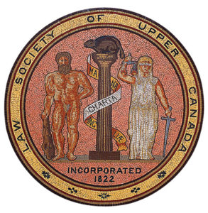
The Law Society’s original coat of arms, painted in 1823.
A journey through time
How the Law Society of Ontario’s coat of arms has changed over the years
In 1994, it fell to designer Dean Martin, creative director of Loopmedia, to come up with a new version of the Law Society’s coat of arms. The original crest dates back to 1823, but it had undergone an update once before, back in 1964.
The Law Society called on Martin because that most-recent version didn’t fax well. Martin came up with a minimalist, stripped-down version of the crest, leaving the iconography intact. “I thought it would be a real shame to drop this huge amount of history.”
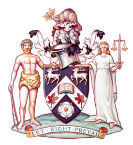
In 1964, the crest underwent this colourful update.
It was a simpler time: his design was approved by “a couple of senior fellows at Osgoode Hall” who were back from lunch. “There was no process,” says Martin.
Martin’s updated design, like the previous iterations, relies on a range of historical symbols. Each one of them has an intended message.
1. The beaver indicates industriousness and its rocky seat represents the firm foundation of justice.
2. Hercules stands with pride, wearing the impermeable pelt of the Nemean Lion as his loincloth to symbolize fortitude.
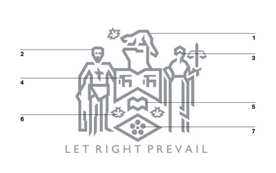
The fax-friendly alternate version, redesigned in 1994.
3. The blindfold of Lady Justice, of course, symbolizes impartiality.
4. The frolicking stags are taken from the coat of arms of an early treasurer.
5. The book stands for the law itself.
6. The maple leaves are dedicated to fallen Canadian soldiers.
7. The white roses are an old symbol of the House of York (the Law Society was founded when Toronto was still known as York).
A case study
When the Hudson’s Bay Company executed its latest rebrand, it revived its historical branding
Five years ago, the Hudson’s Bay Company hired Canadian artist Mark Summers to redraw its original coat of arms. The design features one fox, two moose and four beavers. Beneath the wildlife, you can read the following Latin phrase: pro pelle cutem. Translated, this means “skin for skin,” a rather brutal tribute to HBC traders who risked their own skins as they hunted for furs.
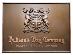
The original HBC branding took the form of this crest.

In its 1965 redesign, HBC completely abandoned its original coat of arms.
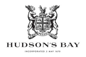
In 2013, HBC revived and revitalized its original crest.
This story is from our Summer 2018 Issue.


