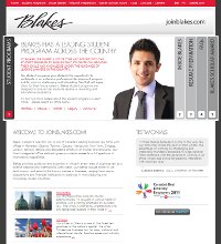
 Earlier this month, Blakes launched Join Blakes, a recruitment site with information about student positions and career opportunities at the firm. Its dual function may be part of the reason behind the simple, relatively unadorned design aesthetic, but it’s the content that’s the story here — particularly the extensive resume preparation component.
Precedent spoke with Blakes’ Director of Student Programs, Kari Abrams, about the site’s philosophy, design and development.
Why is it important for Blakes to have an entire website devoted to student recruitment (as opposed to a page or two on the parent site)?
The joinblakes.com site includes information for both students and other career opportunities within the Firm. The main reason for the focus on student recruitment is that students play a very important and integral role in the Firm’s future. We believe that this is best reflected through a comprehensive website which provides students with a clear picture of our student programs.
How long did it take to conceive and develop the student website?
The conception and development of the student website took approximately 8 months from our first meeting through to our launch date.
What were the principal aims of the site’s design and content?
While the content of our former student website was accurate and helpful to students, we believe that we needed to update the look and feel of the site as well as some of the content to better reflect our student program.
The resume preparation component of the student site is especially comprehensive. Why did Blakes feel that this was such an important feature?
As the Director of the Student Program at Blakes, I often receive calls from students regarding tips and suggestions for cover letters and resumes. As a result, we thought that it would be helpful to provide students with detailed information to assist them when applying to law firms.
Some other firms add myriad interactive offerings to their student sites, including videos, navigable office tours, games and other quirky Flash elements. The Blakes site seems to be focused more on presenting information as simply and cleanly as possible. Why was that decision made?
Our goal was to create a website that was pleasing to the eye, informative and provides real value for the students. Sometimes less is more.
Does your firm have a great online look? Tell us about it and we could profile your website on our blog.

