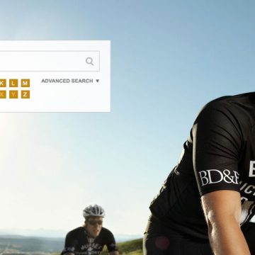
The website of Calgary-based Burnet, Duckworth & Palmer LLP accomplishes two of the most important goals in web design: stunning visuals and a user-friendly interface. Its photography personalizes the firm’s lawyers, showing them outside the office, and the menu system can be navigated with ease.
Precedent spoke with Brian Feick, the firm’s director of marketing, about the site’s philosophy, design and creation.
How long did it take to develop the website?
14 months. They were fun months and it took longer than expected, but we needed the site to hit all the right markers before we pushed it out to the real world.
What are the main concepts of the site’s design?
We needed the site to accurately reflect our culture, be functionally intuitive and be capable of adapting to the seemingly endless change in the digital medium.
The site showcases vibrant, stylish photography. Why did you make this a priority?
We didn’t really make it a priority; it was just something that we naturally gravitated toward. We didn’t ask the photographer, “Hey, come up with something super duper awesome.” We reviewed some portfolios of photographers and found that Roth and Ramberg had a style that we felt reflected the firm: innovative, yet unassuming.
The photographs also show lawyers outside the office: in a farmer’s field, on an airport tarmac and in a bicycle race. How did you decide on these locations?
Again, it just felt natural. I think it’s a given that people who end up on our site know that we are a law firm. Taking the lawyers outside of the boardroom allowed us to show them in a setting that people could relate to more than the expected “handshake in the boardroom, smiling faces, stack of legal documents” photographs. Professional services are so much about the relationship, so why not try to connect through photography in an unexpected setting.
Peppered throughout the website are question-mark icons that viewers can hover over to access additional information. Why is interactivity an important part of web design?
I wouldn’t say that it’s important; it’s just that it has become an expectation because the medium has seemingly endless flexibility.
What pet peeves do have when visiting other firm websites?
I rarely go to other firm sites, so I don’t really have any pet peeves. I had MANY pet peeves about our previous site. And thankfully those have all disappeared…for now.
Does your firm have a great online look? Tell us about it and we may feature your website next month!


